The Palm House: Kitchen Reveal
- HHI

- Dec 2, 2019
- 3 min read
Whew! This year has been a whirlwind, (seriously, how is it almost December already?!), BUT we are finally ready to dive deeper into the details of #ThePalmHouse big reveal!
Given that last week we celebrated one of the best most foodiest days of the year, we are kicking things off with a bang, and heading right into the Kitchen reveal!

This space was just downright ugly when we purchased the property. There’s no way around that, so we’re not even gonna try to sugarcoat it. The bones were sturdy, and it had a couple amazing original windows, but that’s about all it had going for it. It was small and dark, old and kinda smelly, and it just really didn’t make sense in today’s day and age. It was totally a "grandma who never ever cooks" kind of kitchen... I mean the stove was literally in a drawer and the drawer wouldn't open all the way. So yeah, it was pretty much everything you want your kitchen not to be nowadays.

But even with all of that, we immediately saw its potential, and were so excited to get our hands on it! It just needed some love, thoughtful re-imagining, and lots of hard work from the Hearth Homes team. So… that’s exactly what we gave it :)

When planning this part of our remodel, first thing first, we new we needed more SPACE. A tiny galley kitchen just wasn't going to cut it. So we broke down the wall separating the dining room from the kitchen, and then pushed back the opposite wall just a couple feet into the laundry room to maximize space as much as possible.

Once we opened up the walls, we realized there really wasn't much going on in the ceiling above this space, so we said why the heck would we not raise the ceiling up as high as we possibly could?! And boy, are we glad we did that. It made such a huge difference right away!


Next up, one of our favorite parts of any design... TILING! Even though we were able to open up this kitchen quite a bit, it still wasn't exactly the biggest kitchen space we've ever worked on. So, we wanted to design a fun space that would make a statement, but knew we also needed to keep it light and bright. These patterned Bedrosians floor tiles were seriously perfect! We got so many compliments on them, and they made the room feel SO BIG. To complement the grey tones, and to elevate the space, we incorporated a beautiful marble chevron tile for the backsplash, and we think it turned out absolutely perfect!


Now for cabinets...if you are ever on a budget, but you want new, super functional, durable, basically custom without the scary price tag cabinets.. look no further. IKEA is your answer! We ended up going with the Axstad cabinet fronts because we wanted something classic, modern, bright, and simple, but they have tons and tons of options to choose from! The process can be a little complicated and confusing at first, but don't let that scare you away! If you have the patience, and someone who knows how to install cabinets well, this could be the perfect solution for you!
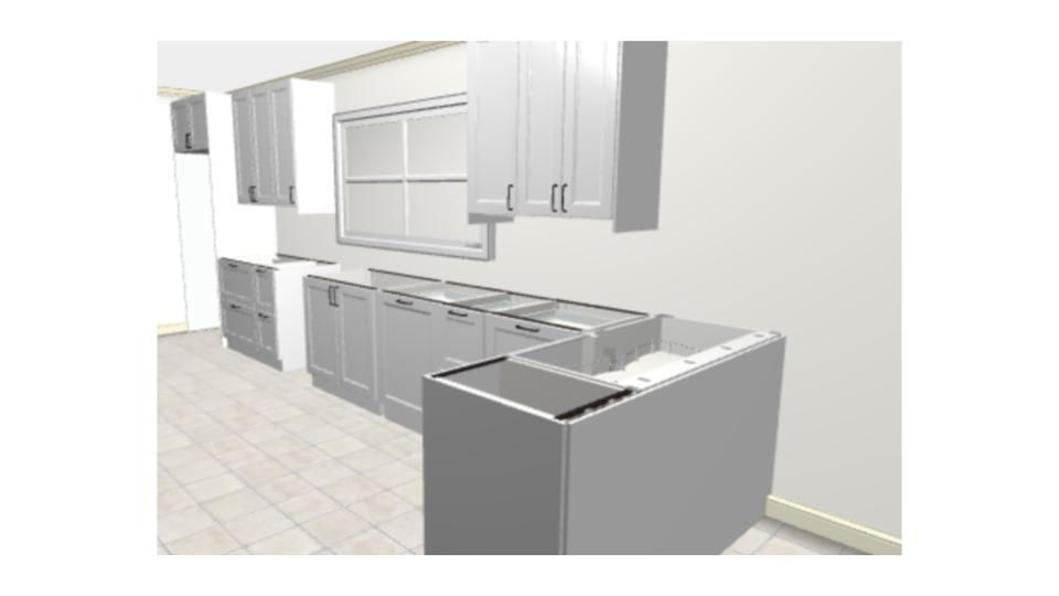
* IKEA's Kitchen Planner tool in action


Since this was the most classic and charming modern farmhouse, we wanted to add that touch in the kitchen, and what better way to do that than shiplap?! We envisioned this awesome shiplap-wrapped vent hood, and the guys were able to pull it off flawlessly!


Because we took away the separation of the kitchen and dining room when we removed that wall, we needed to figure out the best way to incorporate a new dining situation and again, to make the most out of the space that we did have. So, in came this beautiful dining banquette! We've always wanted to put one of these in a renovation project, and this was literally the perfect opportunity. With those giant original windows... I mean come on, they were begging for a cute little bench! We were able to make the bench large enough to fit a nice big, round dining table, so all together, this space could probably comfortably seat 6-7 people! Perfect for entertaining if you ask us. To top it off, this Shades of Light oversized chandelier really just tied the whole space together.


And last, but certainly not least, we chose to sprinkle in pops of black for the hardware and accents. The cabinet pulls and vintage inspired matte black faucet bring so much personality and character into the space, and make it feel even more warm and inviting.


And thats a wrap! At least for the kitchen...stay tuned for more of #ThePalmHouse Reveal, and don't forget to let us know what you think in the comments below!


Comments